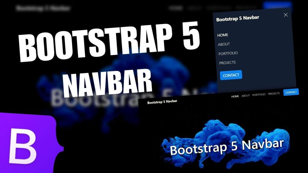
Want to learn how to build a simple responsive navigation bar, with HTML, CSS & JavaScript, for your website or for any kind of website? This tutorial will teach you everything you need to know!
In this tutorial I show you step by step how to create a mobile friendly / responsive website navbar using HTML, CSS and JS ( JavaScript ).
For this video I used:
- Visual Studio Code Editor ( VSCode )
- Google Fonts for Roboto text font
- W3school Font Awesome for the Menu Burger Icon
- Unsplash for the Free High Resolution Images
Other web development videos on my channel:
- How to make a Bootstrap 5 responsive landing page website
- Responsive login and register form using HTML, CSS and JavaScript
- Responsive Bootstrap 5 landing page design | Full Tutorial
- How to make a responsive Bootstrap 5 website | Full Tutorial
- Transparent website navbar and header using HTML, CSS and JS
Blog categories:
Thanks for watching !
If you enjoy the video, please leave a like and a comment and make sure to SUBSCRIBE for more. Like this you will help the channel to grow.


