Are you looking to add a stunning image gallery to your website that adapts to different screen sizes? In this article, I will show you how to create a responsive image gallery grid using HTML and CSS.
Want to learn how to build a responsive image gallery grid, only with HTML and CSS, to showcase your pictures or your projects in your own portfolio website or in any kind of website? This video will teach you everything you need to know!
In this tutorial I show you how to make a responsive images gallery grid using html & css.
For this tutorial I used:
- Visual Studio Code Editor ( VSCode )
- Unsplash for the Free High Resolution Images
- Google Fonts
Other web development videos on my channel:
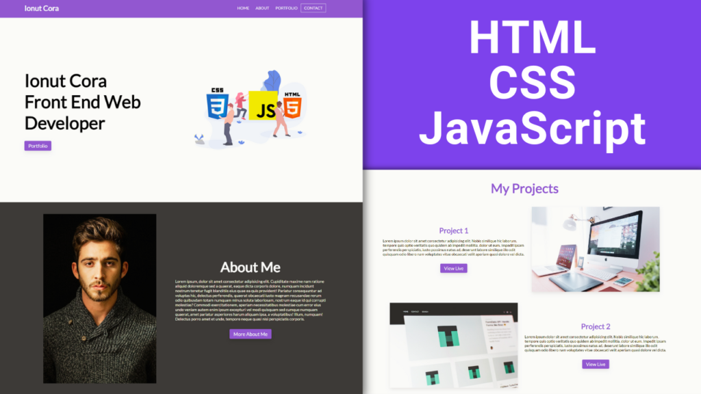
- How to make a responsive portfolio website using HTML, CSS and JavaScript
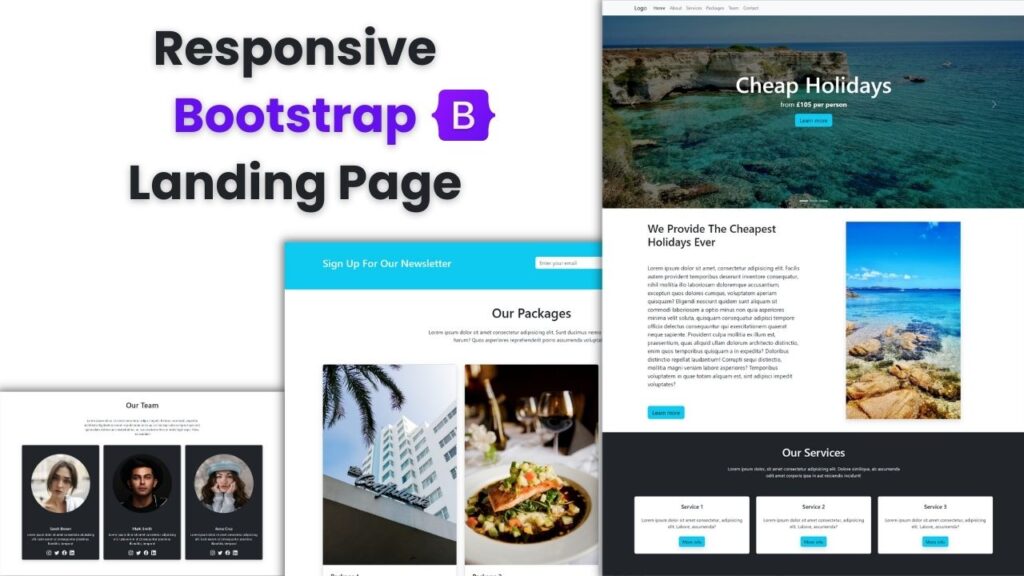
- How to make a Bootstrap 5 responsive landing page website
- Responsive login and register form using HTML, CSS and JavaScript
- Responsive Bootstrap 5 landing page design | Full Tutorial
- How to make a responsive Bootstrap 5 website | Full Tutorial

It induced imaginative and prescient and speech problems, in addition to problem strolling, but he was capable of continue writing.
That mentioned, it is crucial that you simply hire a professional company incentive travel program planner in case you need to motivate or reward your helpful staff.