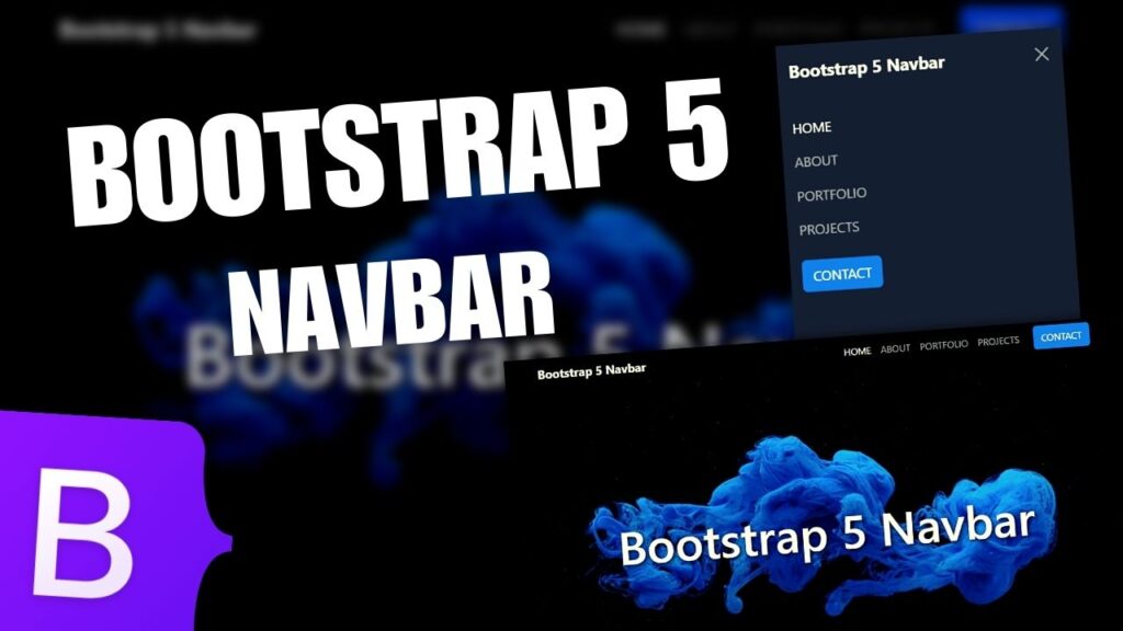
Want to learn how to make your website in 2024, with Material Design for Bootstrap 5 or MDB, HTML and CSS? This video will teach you everything you need to know for free!
In this video, we explore the power of responsive web design using Bootstrap 5 , the latest version of the popular front-end framework using with Material Design. Learn how to create stunning, mobile-friendly websites that adapt seamlessly to different screen sizes and devices.
For this tutorial I used:
Recommended web development tutorials:
- How to Create a Responsive Website with Bootstrap 5 & Material Design | Courses Page | PART 2
- How to Create a Responsive Website with Bootstrap 5 & Material Design | About Page | PART 3
- How to Create a Responsive Image Gallery Grid with HTML and CSS | Web Design Tutorial
- How to Make a Responsive Portfolio Website using HTML CSS and Javascript
- How to Make a Bootstrap 5 Responsive Landing Page Website
Blog categories:
Thanks for watching !
If you enjoy the video, please leave a like and a comment and make sure to SUBSCRIBE for more. Like this you will help the channel to grow.
I have been examinating out some of your stories and i can claim pretty good stuff. I will surely bookmark your blog.
Thank you for sharing with us, I conceive this website genuinely stands out : D.
I have been absent for a while, but now I remember why I used to love this site. Thanks , I¦ll try and check back more often. How frequently you update your web site?
I have not checked in here for some time since I thought it was getting boring, but the last several posts are good quality so I guess I’ll add you back to my everyday bloglist. You deserve it my friend 🙂
Admiring the time and effort you put into your site and detailed information you offer. It’s nice to come across a blog every once in a while that isn’t the same outdated rehashed material. Wonderful read! I’ve saved your site and I’m including your RSS feeds to my Google account.