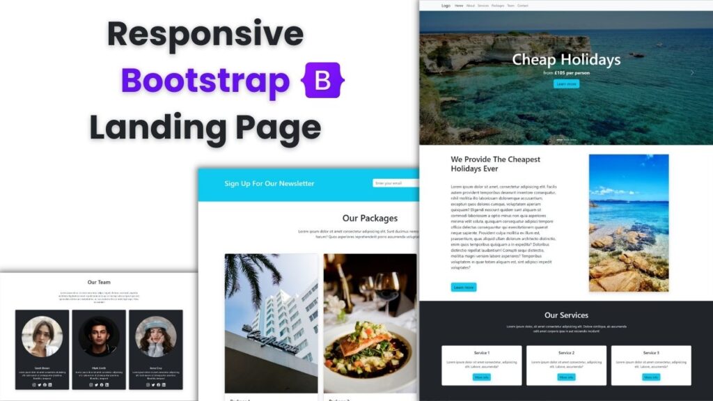
In this tutorial I show you step by step how to create a Responsive / Mobile Friendly website, using Bootstrap 5, HTML and CSS.
For this video I used:
- Visual Studio Code Editor ( VSCode )
- Bootstrap 5
- Google Fonts for Poppins text font
- Unsplash for the Free High Resolution Images
Other web development videos on my channel:
Blog categories:
Thanks for watching !
If you enjoy the video, please leave a like and a comment and make sure to SUBSCRIBE for more. Like this you will help the channel to grow.

I always spent my half an hour to read this webpage’s content daily along with a
cup of coffee.
You ought to be a part of a contest for one of the best websites online.
I most certainly will highly recommend this
web site!
WOW just what I was looking for. Came here by searching for check
this
My brother recommended I would possibly like this web site.
He used to be entirely right. This publish actually made
my day. You cann’t consider just how a lot time I had spent for this
info! Thank you!
The level of my enthusiasm for your work is the same as yours. The sketch is tastefully done, and the authored material has excellent qualities. Despite your uneasiness, it appears that you are unwilling to proceed in a direction that might cause anxiety. I’m certain you’ll be able to handle this situation effectively.
constantly i used to read smaller posts that as well clear
their motive, and that is also happening with this article which I am reading at this place.
Great article, totally what I wanted to find.
Excellent post. I was checking continuously this blog and I am impressed!
Very helpful information specifically the last part 🙂 I care for such info a lot.
I was looking for this certain information for a very long time.
Thank you and good luck.